Exercises: Describing Data
Question 3.1
The data below are taken from a paper looking at the physical and mental health of new dental graduates (Baldwin et al., 1999, Young dentists - work, wealth, health and happiness, BDJ 186: 30-36). It shows the number of students with different levels of outstanding debt at graduation. Draw a histogram of the data, stating any assumptions you make.
| Level of debt | Number of students |
|---|---|
| Less than £1000 | 79 |
| £1000 - £2999 | 45 |
| £3000 - £4999 | 25 |
| £5000 - £6999 | 15 |
| £7000 - £8999 | 11 |
| £9000 or more | 4 |
Question 3.2
The data below are taken from a paper looking at the effect of a chlorhexidine varnish on occlusal caries (Fennis-le et al., 1998, Effect of 6-monthly applications of chlorhexidine varnish on incidence of occlusal caries in permanent molars: a 3-year study, Journal of Dentistry 3: 233-238). One group of children had a chlorhexidine varnish applied to their teeth another group received a placebo. The table shows the number of children in each group who had 0, 1, 2, 3 or 4 carious permanent molars at the end of the study. Plot the data on an appropriate graph and make a judgement about the clinical effectiveness of the varnish based on your graph.
| Number of carious molars | Chlorhexidine group | Placebo group |
|---|---|---|
| 0 | 86 | 80 |
| 1 | 11 | 5 |
| 2 | 20 | 21 |
| 3 | 8 | 6 |
| 4 | 38 | 41 |
Question 3.3
The data in the table below are taken from a past Leeds undergraduate project. They represent the time patients spent being attended by their dentist. Draw a histogram of the data and comment on the shape of the distribution.
| Time with dentist | Number of patients |
|---|---|
| Less than 12·5 minutes | 5 |
| 12·5 - 15·0 minutes | 12 |
| 15·0 - 17·5 minutes | 6 |
| 17·5 - 20·0 minutes | 2 |
| 20·0 - 22·5 minutes | 7 |
| 22·5 - 25·0 minutes | 11 |
| 25·0 - 27·5 minutes | 7 |
| More than 27·5 minutes | 1 |
Question 3.4
The data below were collected as part of a Leeds MDentSci project looking at the effectiveness of a new type of toothbrush. They are the plaque scores recorded from 40 schoolchildren at the start of the study.
| 1·9 | 1·9 | 2·2 | 2·2 | 2·2 | 2·2 | 2·2 | 2·3 | 2·3 | 2·3 |
| 2·3 | 2·4 | 2·5 | 2·7 | 2·7 | 2·7 | 2·7 | 2·8 | 2·8 | 2·9 |
| 2·9 | 2·9 | 2·9 | 2·9 | 3·0 | 3·0 | 3·0 | 3·0 | 3·1 | 3·1 |
| 3·1 | 3·2 | 3·2 | 3·3 | 3·3 | 3·4 | 3·4 | 3·5 | 3·5 | 4·1 |
Calculate the mode, median and mean of this data set.
Draw a box and whisker plot of this data set and use it to help you decide which of the three measures of location you calculated was the most appropriate. Calculate the most appropriate measure of spread.
Question 3.5
The results of a sex survey conducted in the Chicago area had results that claimed the average number of sex partners was 6 for men and 2 for women.
This result caused controversy on a statistical newsgroup. Some statisticians claimed that this was an impossible result; others claimed it was statistically reasonable; still others claimed it was simply a result of the men and women lying to the surveyors.
Let's make these simplifying assumptions: there are N women and N men; all of the sexual activity took place within this group of 2N people; all sexual activity was heterosexual. The diagram below represents a small population of 7 men (red dots) and 7 women (blue dots) which we will use to investigate the problem. Sexual partnerships are represented by the lines joining the dots.
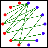
Calculate the average number of partners for men and women and try to decide why the argument arose. Is it possible for the results of the original survey to be true or was there some lying?
Question 2.6
Match each of the following histograms (A to F) with one set of summary statistics (1 to 6).
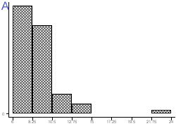
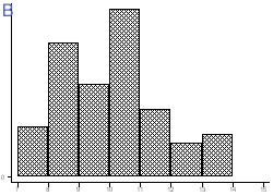
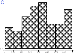
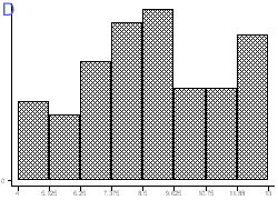
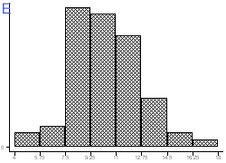

Summary statistics
| 1 | 2 | 3 | 4 | 5 | 6 | |
|---|---|---|---|---|---|---|
| Mean | 8·9 | 10·3 | 10·1 | 4·8 | 8·9 | 8·9 |
| Standard deviation | 2·4 | 2·3 | 1·6 | 3·0 | 2·4 | 2·4 |
| Median | 8·4 | 10·2 | 10·2 | 4·2 | 9·6 | 8·6 |
| IQR | 7·4 to 9·6 | 8·8 to 11·8 | 8·8 to 10·9 | 2·5 to 6·3 | 7·8 to 10·4 | 7·2 to 10·7 |