Solution to question 3.1
If you drew a bar chart by mistake then it should look like fig. 1. However, a bar chart isn't appropriate here: it doesn't make full use of the fact that debt is a continuous metric variable.
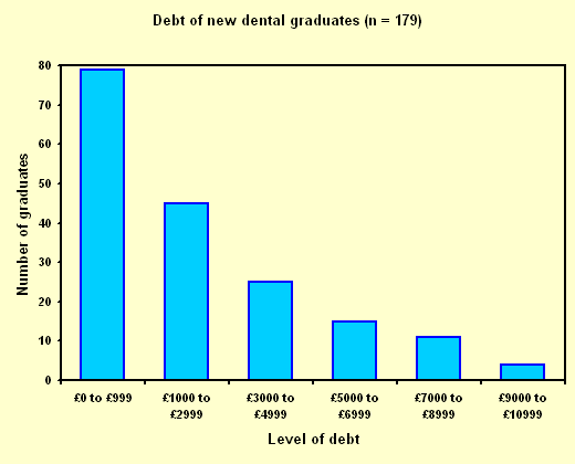
Figure 1
To draw a histogram we need to make reasonable assumptions about the highest and lowest levels of debt. I decided to take the lowest level of debt to be £0 and the highest to be £10,999. If you chose different values then your histogram will look slightly different. If we now draw the histogram using the frequencies given in the question we get fig. 2.
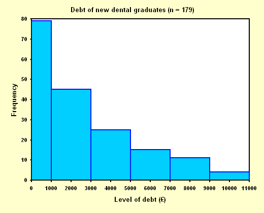
Figure 2
Fig. 2 is wrong. We need to take account of the fact that the first interval (£0 to £999) is only half as wide as the other intervals. We do this by halving the frequency (number of students) for the wider intervals interval. This gives us the fourth column of the table below. As I was also drawing a histogram based on proportions I halved the values of the proportions as well to give the last column of the table. (Some proportions may look a little odd because of apparent errors when I rounded the values for the table.) You may have used percentages rather than proportions, in this case you will have percentages a hundred times bigger than my proportions. The correctly drawn histogram is fig. 3
| Level of debt | Number of students | Proportion of students | Adjusted no. of students | Adusted prop. of students |
|---|---|---|---|---|
| £0 - £999 | 79 | 0·44 | 79 | 0·44 |
| £1000 - £2999 | 45 | 0·25 | 22·5 | 0·13 |
| £3000 - £4999 | 25 | 0·14 | 12·5 | 0·07 |
| £5000 - £6999 | 15 | 0·08 | 7·5 | 0.04 |
| £7000 - £8999 | 11 | 0·06 | 5·5 | 0·03 |
| £9000 - £10,999 | 4 | 0·02 | 2 | 0·01 |
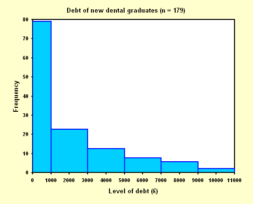
Figure 3
Note that the histogram has a title and both axes have titles, this is compulsory. Unless we are told what a graph is about it has no value. Similarly it is important to include information about any units used; the debt is in £s. Also, we should indicate somewhere how big a sample size the graph was based on (n = 179 here). Fig 4 shows the histogram drawn using proportions rather than the raw numbers. I tend to prefer this approach as it is easier to generalise the impressions received from the sample back to the population.
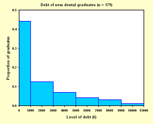
Figure 4
It might be useful to compare fig. 4 with fig. 1. Notice how the histogram gives us a much better idea of how quickly the number of students in a particular amount of debt falls off with increasing levels of debt. The histogram also shows us that this data set is strongly positively skewed, this allows us to make a more informed choice about what sort of summary statistics might be appropriate to describe it.