Solution to question 3.2
It is possible that you drew a histogram here. Sometimes a histogram is desirable for a discrete metric variable. (Number of carious molars is clearly a discrete metric variable as it is countable.) When there are so few values (only five here) it normally makes more sense to treat it as an ordinal variable for graphing purposes and use bar charts. The appropriate graph to use here is a stacked bar chart. You may have drawn a graph such as fig. 1 with the vertical axis representing the number of children for each category. This would be OK if you were just looking at one of the two groups and had drawn an ordinary (not stacked) bar chart. It isn't right if you're making a comparison.
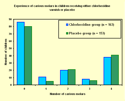
Figure 1
The reason fig. 1 is wrong is the difference in sample size in the two groups. There are fewer children with no carious molars in the placebo group than in the chlorhexidine group. We don't know if this is because there is a real difference bewteen the groups or simply because there were fewer children in the placebo group. We can overcome this problem by comparing the proportions (or percentages) in each category for each group. This is done in fig. 2. The difference between the two charts is not too great in this instance (although it is noticable); in some cases making this sort of mistake can lead to gross errors of judgement.
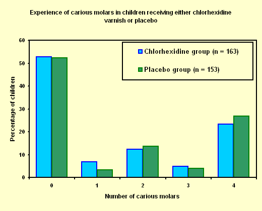
Figure 2
We might conclude from looking at fig. 2 that the chlorhexidine varnish showed no significant improvement over placebo in terms of caries experience so that on this evidence we would not recommend using it.